 22 Nov 25
Your pricing page is where interest becomes revenue or quietly stalls. Nine proven pricing page patterns, what each one does well, and the specific situation where it is the right choice, not just the popular one.
The pricing page is one of the highest-stakes pages on any SaaS site and one of the most copied without thought. Teams see a competitor’s three-column layout and clone it, whether or not it fits how they actually sell. But pricing patterns are tools, and each one solves a specific problem. Using the wrong one is like using a wrench as a hammer: it sort of works, and it quietly costs you. Here are nine pricing page patterns, what each does well, and the situation where it is genuinely the right call.
Part 1
The Classic Structures
✅ 1. The Three-Tier Table
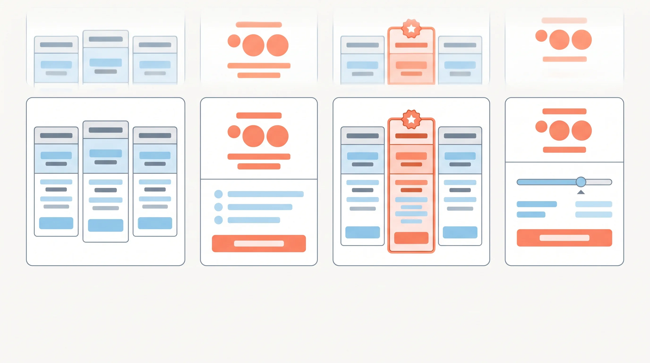
The default for good reason: three plans side by side, usually good-better-best. It works because three options let you anchor with a high tier, sell the middle, and catch the price-sensitive with the low one. Use it when you have genuinely distinct tiers for genuinely distinct customers. Do not use it when your three tiers are really one product with arbitrary limits, because customers can smell a fake ladder.
✅ 2. The Highlighted Recommended Plan
A variation on the table where one plan, usually the middle, is visually elevated as “most popular” or “recommended.” This works because choice is stressful and a gentle recommendation reduces the anxiety of deciding. Use it when you have a clear plan you actually want most customers on. Be honest about which one you highlight, because steering people to the wrong plan for them buys one sale and loses the relationship.
✅ 3. The Single-Plan Page
One plan, one price, no table. Radical in its simplicity and surprisingly powerful. It works because it removes the entire cognitive load of comparing tiers and says, in effect, “this is what it costs, take it or leave it.” Use it when your product genuinely suits one plan, or when your brand is built on simplicity. It is a confident move that only works if the single price is genuinely fair.
Part 2
The Usage and Scale Patterns
✅ 4. The Usage-Based Calculator
An interactive element where the visitor enters their usage (seats, contacts, volume) and sees their price. It works because it makes a usage-based model feel transparent instead of scary. Use it when your pricing genuinely scales with usage and a flat table would misrepresent the cost. Do not use it to hide a confusing model behind a friendly slider, because a calculator that produces surprises destroys trust fast.
✅ 5. The “Contact Us” Enterprise Tier
The final column that shows no price and a “talk to sales” button. It works because genuinely large deals need a conversation, and a fixed number would either scare small buyers or leave money on the table with large ones. Use it as the top tier when you truly have enterprise deals worth a sales call. Do not use it for your main plans, because hiding all your prices behind “contact us” is the single fastest way to lose the self-serve buyers who wanted to just sign up.
✅ 6. The Freemium Anchor
A free tier sitting at the base of the table, designed to get people in the door. It works when the free tier delivers real value and creates a natural path to paying as the user grows. Use it when your product has a genuine try-before-scale dynamic and the cost of serving free users is manageable. Do not use it when free users cost you as much as paying ones, or when the free tier is so limited it just frustrates people into leaving.
Part 3
The Trust and Framing Patterns
✅ 7. The Annual-Default Toggle
A monthly-versus-annual switch, usually defaulted to annual with the discount shown. It works because it nudges toward the commitment you prefer while still offering flexibility. Use it when annual billing genuinely helps your business and you can offer a real discount for it. Keep the toggle honest and the monthly option easy to find, because a discount that feels like a trap sours the whole page.
✅ 8. The Feature-Comparison Matrix
The detailed grid of every feature across every plan, usually below the main table. It works for buyers who need to verify that a specific capability is included before they commit. Use it as a supplement for considered, feature-driven purchases, placed below the simple table for those who want to dig in. Do not lead with it, because a wall of checkmarks up top overwhelms the majority who just wanted to see three prices.
✅ 9. The Reassurance Cluster
Not a layout but a pattern that belongs on every pricing page: the cluster of trust signals around the buttons. A money-back guarantee, “no card required,” “cancel anytime,” a security note, a recognisable logo or two. It works because the pricing page is peak anxiety, the moment of deciding to pay, and reassurance placed exactly there converts hesitation into action, the same way it does on any high-stakes form. Use it always. There is no situation where a pricing page is improved by having its anxieties left unanswered.
How to Choose
Do not pick a pattern because a competitor uses it. Pick it from how you actually sell: how many genuinely distinct customer types you have, whether your cost scales with usage, whether your deals need a conversation, and how much your buyers want to compare before committing. Match the pattern to your reality and the page does its job. Clone a pattern that fits someone else’s business and you inherit their pricing logic without their product, which is exactly the inside-out mistake that quietly costs conversions across the whole site.
And remember that these patterns combine. A real pricing page is rarely one pattern in isolation: it might be a three-tier table with a highlighted middle plan, an annual toggle, an enterprise “contact us” column, and the reassurance cluster, all at once. The art is choosing the combination that matches how you sell without overwhelming the page, because every element you add is one more thing the visitor has to process before they decide. Start with the simplest structure that fits, then add only the patterns that earn their place.
If you want your pricing page built around how you actually sell, that is a conversation away.